
It’s a story with a curious beginning, carried forward by a mix of inspiration and logic to an entirely fitting conclusion.
Legend has it that in 1947 when Mr. Bill Dolfin was the Personnel Manager of Waterford, he decided that the company needed a distinctive label for its crystal. Discussions turned to the Waterford City Coat of Arms, which has two supports, a sea creature and a lion, and it was suggested the sea creature could be modified into an image to suit the label. After all, this heraldic creature symbolises Waterford’s maritime connections – in the Middle Ages Waterford was Ireland's largest port – and it was the potential for exporting that had attracted the founders of Waterford Crystal here in the first place.
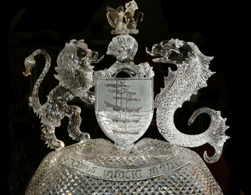
There was some uncertainty as to exactly what kind of sea creature the heraldic creation was, but Bill Dolfin quickly declared it to be a dolphin. It was no secret, that, as he shared a similar sounding name to the said sea creature, he believed his association with Waterford Crystal would live on in posterity! While it was generally agreed that the sea creature bore little similarity to a dolphin, it was felt it did vaguely resemble a seahorse.
Mr. Havel, Waterford’s Chief Designer from the early 1940's, then proffered two very convincing reasons as to why the seahorse would be appropriate for the Waterford symbol. Firstly, that the curved shape of the seahorse would lend itself far more artistically to the type of label he had in mind to design. Secondly, and perhaps more importantly, was the fact that the seahorse was a truly original and unique sea creature, given that the male seahorse was the carrier during reproduction, unlike any other sea life.
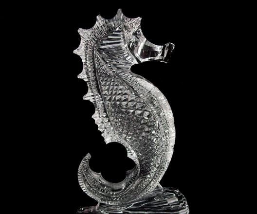
Because Waterford Crystal was also considered unique in its beauty, it was agreed that the designing of the original symbol would be based on the concept of a "Sea Creature" similar to a seahorse. The symbol was further developed over the years and in 1986, it was decided that, although now well known, the symbol needed refinement to conform to the more stringent design concept of the times. So, it was decided to define the seahorse shape that is seen today.
A curious tale, but one that highlights how creative processes can come to a final, elegant conclusion.